The latest update of the KUBE introduces further aesthetic enhancements to elevate the visual appeal of our platform. This release focuses on making the user interface more visually engaging, allowing businesses to showcase their promotions and package discounts more effectively.
Key Updates
- Refreshed Elements: We have revamped more KUBE UI elements, bringing a new and vibrant design to the forefront. This not only enhances the aesthetics but also ensures a more contemporary look and feel across the platform.
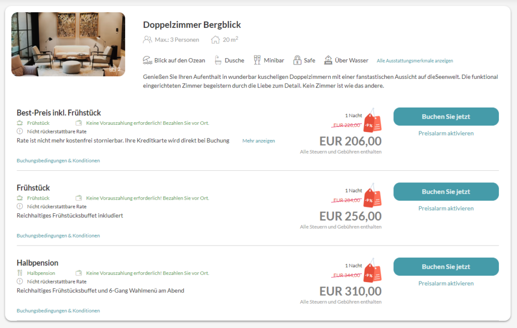
- Individual Customization: With this release, customers can now define how discounts are visualized for each individual Circle. The options include retaining the current display with a red background and -X%, or choosing from three provided icons. What’s even more exciting is that web agencies can easily adapt these icons using custom CSS, providing unparalleled flexibility for our users.

Go to the Booking Engine menu and click on Overview. Choose the booking engine you wish to customize the display for, and scroll down to the “Circle configuration” section. Within this section, locate the “Price display” option, where you can pick the preferred discount presentation. Decide between the traditional red background with a percentage display or select one of the three available icons. For a more personalized touch, your web agencies have the flexibility to customize the icons using custom CSS!
- Search Bar Layout: The layout of the booking selector has been updated to seamlessly integrate with the new fresh design. This ensures a cohesive and visually pleasing experience for users navigating through the booking process.

These enhancements not only make KUBE more visually appealing but also provide practical tools for businesses to communicate their discounts effectively to customers.
