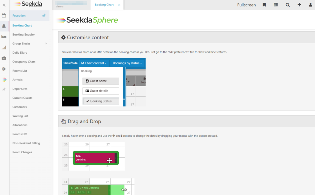
The Psychology of Color in Hotel Bookings: How to Influence Guest Decisions
Ever wondered why some hotel booking engines and brand websites feel more trustworthy, luxurious, or inviting? Understanding color psychology in hotel bookings is key. The colors you use in your branding, website, and booking engine play a crucial role in shaping guest perceptions and influencing their decisions. Let’s break it down!
 Blue – Trust, Honesty, Serenity, Reliability
Blue is widely used in the hospitality industry to inspire confidence and create a sense of security.
- Ideal for payment pages, loyalty programs, and booking confirmations.
- Encourages professionalism and reliability, making guests feel at ease.
- Commonly used by well-established hospitality brands to reinforce trust.
 Green – Growth, Reassurance, Health, Sustainability
Green is the color of nature, wellness, and renewal, making it a go-to choice for eco-friendly hotels and wellness retreats.
- Encourages a sense of relaxation and balance—perfect for spa and nature-based tourism.
- Soothing to the eyes, making it a great choice for call-to-action buttons that invite bookings.
- Represents sustainability and environmental consciousness, attracting eco-conscious travelers.
 Yellow – Optimism, Friendliness, Happiness, Energy
Yellow radiates warmth, enthusiasm, and positivity, making it ideal for creating an inviting atmosphere.
- Often used in promotions, limited-time offers, and call-to-action buttons.
- Works well for family-friendly hotels and budget stays that emphasize fun and affordability.
- Encourages action, but should be used in moderation to avoid overwhelming users.
 Orange – Fun, Action, Excitement, Confidence
Orange is a bold, energetic color that stimulates enthusiasm and urgency.
- Perfect for “Book Now” or “Limited Deal” buttons to encourage immediate action.
- Used by adventure hotels and youth hostels to evoke creativity and fun.
- Works well for engaging impulsive bookers looking for last-minute deals.
 Red – Passion, Urgency, Power, Excitement
Red is a powerful color that grabs attention and creates urgency, making it ideal for special promotions and flash sales.
- Increases heart rate, prompting guests to act fast on deals.
- Effective in restaurant booking sections and food & beverage promotions.
- Should be used sparingly, as too much red can feel overwhelming.
 Purple – Luxury, Creativity, Mystery, Royalty
Purple is often associated with sophistication and exclusivity, making it a favorite for luxury hospitality brands.
- Used in boutique hotels, high-end resorts, and VIP packages.
- Symbolizes creativity and uniqueness, perfect for exclusive experiences.
- Works well for spa services and wellness retreats aiming for an elegant touch.
 Black – Elegance, Power, Exclusivity, Sophistication
Black is synonymous with luxury and prestige, making it a staple in high-end hotel branding.
- Ideal for premium travel services, private villas, and 5-star resorts.
- Communicates exclusivity and sophistication, appealing to high-net-worth travelers.
- Works well in minimalist designs but should be balanced to avoid a heavy or serious tone.
 White – Simplicity, Cleanliness, Clarity, Modernity
White creates an open and clean aesthetic, often associated with modernity and high-end experiences.
- Used by luxury travel brands and wellness retreats to evoke purity and freshness.
- Enhances the user experience in hotel booking engines by creating a sense of spaciousness.
- Pairs well with other colors to balance the overall branding tone.
 Takeaway: Choose Colors Wisely!
The colors in your booking engine, website, and overall branding significantly impact guest emotions and decisions. A well-thought-out color strategy can enhance trust, create urgency, and ultimately drive direct bookings.
 Which color best represents your hotel brand? Let us know in the comments! https://www.linkedin.com/feed/update/urn:li:activity:7307777815033077760